-
Welcome to Smeargle's Studio! Please be sure to review the studio rules. Feel also free to check out our hub to learn more about this place!Welcome to Smogon! Take a moment to read the Introduction to Smogon for a run-down on everything Smogon, and make sure you take some time to read the global rules.Congrats to the winners of the 2023 Smog Awards!
chaos needs help: IRC client
- Thread starter chaos
- Start date
any size limits for the site one? (I don't want to make its proportions wierd so it looks funny resized)
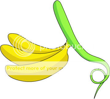
EDIT: nvm. 300x300 it says. "banana vine" sounds wierd to me. maybe its because bananas don't grow on vines...
EDIT:
here, Even used a grape style vine since that's where the name comes from.

not sure If I like the text or not.I can change that though if necesary.

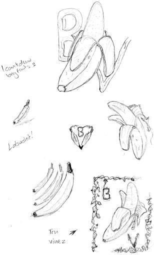
youtube is a great teacher for photoshop :)I'm no good at digital art, yet.
I'd do some actual drawings on there, but my mouse is too jumpy for it and don't have a tablet yet = /
That's too complicated, and the edges aren't clean.. Try to imagine that as a website logo, it would look awkward.any size limits for the site one? (I don't want to make its proportions wierd so it looks funny resized)
EDIT: nvm. 300x300 it says. "banana vine" sounds wierd to me. maybe its because bananas don't grow on vines...
EDIT:
here, Even used a grape style vine since that's where the name comes from.
not sure If I like the text or not.I can change that though if necesary.
Note that 300x300 isn't a hard restriction, it's just an idea. It doesn't even have to be proportional to 300x300.
Also, I've decided I don't really like logos that try to do clever things with the text in relation to the picture. It looks awkward for website logos, and it is hard to scale down to icon size (remember there has to be a 16x16 logo as well, although this one can be dramatically simplified).
here is a simpler version:That's too complicated, and the edges aren't clean.. Try to imagine that as a website logo, it would look awkward.
Note that 300x300 isn't a hard restriction, it's just an idea. It doesn't even have to be proportional to 300x300.


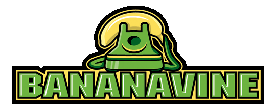
This is my favorite so far. As Steelicks said on IRC, it's colorful, bold, and simple. I think the "vine stem" is out of place however, how about the banana being loosely wrapped in some sort of vine? Of course, it shouldnt overtake the banana and should still look relatively simple.Here's mine, made on Illustrator for easy resizing
A huge improvement over your original!here is a simpler version:

just made it a little brighter and added some texture to the leaves,the leaves without any texture looked wierd to me = /My artistic abilities aren't as good as they used to be, but I just wanted to put up a concept for a logo that no one has put up, yet:

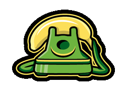
I just put this together real quick in Paint. The bananas are supposed to be phones while the vine is a phone line.
If anyone wants to build on this idea, by all means do so as this particular image just isn't up to snuff.
EDIT: It actually looks more like a banner than a logo, now that I think about it. It doesn't matter. I just wanted to put the idea out there.
oh, I like that a lot too, Tracker. It'd be better if the logo wasn't diagonal - it'll take up less space. The great thing about icepick's 200x200 is that it makes excellent use of all the space allotted to it; there aren't any empty areas. If you dropped the "diagonal" aspect of it and made it a bit more compact I could see that being a serious contender.
Don't worry about adding text; I just want a logo design. I plan on putting text underneath it for the website and for the icons I don't plan on having text at all (which is why having blank areas is rather awkward)
How about this:that little grape looking thing holds onto the banana and the vine trails off to the right slightly or curls down. We could have two people talking, but I think the logo would be much more simple and eye catching if it was just one person "using" the banana. Of course, feel free to prove me wrong if you can make the two people idea work without making it diagonal or having it take up a lot of room.
addendum: thanks for all of your help guys! These logos are starting to look good :) the two bananas being linked up to a vine is a great idea; it symbolizes both the name and the function of the program. that being said, as long as the logo is simple, bold, and is likely to be instantly recognizable (such as icepick's latest effort), such submissions would be ideal
Users Who Are Viewing This Thread (Users: 1, Guests: 0)
- ... and 1 more.