Judge a Pokemon: The Smog's 5th Art Panel
| « Previous Article | Home | Next Article » |
Introduction
Welcome everyone, to the fifth installation of Judge a Pokemon, where commentators from the Smeargle Studio community come together to give you our brutally honest opinions of Game Freak's Pokemon designs! I promise this will be another delightful round of judging!
This issue I'll be taking a back-seat to make way for a special guest panelist, Kevin Garret! Kevin's a well-known member of the battling community, but he's also a great dabbler in the arts and a former Smeargle-mod. Please look forward to more great guest panelists in the future!
Reference: Kinneas's comments are in red, Swaggersaurus's are in yellow, Kevin Garrett's are in green, Alchemator's are in blue, and Fatecrashers's are in beige.
1. Maractus


Hello everyone! I'm sure by now you all know the drill, so let's get on with it. Maractus is okay, I guess. It certainly looks like a cactus, and I like the Mexican motif going on which ties together cacti and maraccas and all that son jazz. That said, I still don't feel like Maractus has a terribly memorable design. Frankly, I had to look it up, and whilst I like it on closer inspection, I think it speaks volumes that this mon was entirely forgettable to me. It is a nice concept, and it is even nicely executed, I guess it just failed to hit the sweet spot with me.

Ooo, Maractus! For some reason I actually quite like this design, though in the league of "cactus Pokemon" it doesn't have much competition. Cacturne is a bland, gingerbread man of a plant, with a hat which is nightmarish in spriting. Maractus, on the other hand, is a lovely Pokemon. It contrasts the strong (and different shades!) of green with some lovely pink flowers. The only thing that I dislike about Maractus is its... foot? I understand that a cactus with two legs would be even stranger (hey Cacturne), but hopping around is a little odd too. It needs Swords Dance too--Wood Hammer is a little lonely in its moveset...

Oh Maractus, don't listen to those meanies. You are an adorable little plant with a wonderfully ditzy expression and a cute concept. It's sort of like... a rabbit mated with a prickly pear. I'm not entirely sure on the intricacies of that particular breeding ritual, but I imagine it would be very painful for the rabbit. Anyway, I think Maractus has a great design. It would have been tempting to scatter any cactus pokemon with thorns and prickles that could have ruined the design, but the features that make it a cactus are subtle and not too busy as to divert from the dorky smile, but still present enough to let you know that Maractus is a cactus.

Evidently not satisfied with the existing token cactus in Cacturne, Game Freak has decided to step up their game with the addition of yet another totally forgettable Pokemon in Maractus. I guess they were trying to be more feminine with the two flowers at the top, but it doesn't really work well with the spikes and the jack-o-lantern-ish face. The whole appearance of this Pokemon feels very unbalanced; there's two parts up on the head for the flowers, two parts for the arms, yet only one part rooted to the ground, giving the impression that this cactus could topple over at any moment. Not impressed.

Nothing about Maractus stands out at me. Maybe it's because they already made a cactus Pokemon in Cacturne. I just don't feel like they can get a lot of mileage with a cactus. I have to give them some credit for taking a different approach with Maractus, though. It is a more realistic depiction of a cactus than Cacturne. Overall, Maractus is a less memorable version of Roselia for this generation. Let's hope Game Freak doesn't give it an evolution in the next generation.
2. Herdier
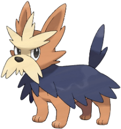
There are very few Pokemon who are quintessentially British, but thankfully Herdier is one of them. In fact, this moustached pooch, in my opinion, defies the age-old stereotype of middle-evolutions being terrible. Herdier is probably the best of the line, with the Pokemon either side of it either lacking facial features or simply being obese. I'll leave you, Sherlock, to discern which Pokemon I'm talking about. Actually, mentioning Sherlock brings up a nice image of Herdier in a deerstalker. Herdeerstalker? Hm...
I'm usually not too keen on first route Pokemon and their evolutions, but I have to admit they did a good job on Herdier. The mustache and coat give it a lot of personality. It's cool how they design some Pokemon to reflect a certain culture. With how many Pokemon there are now, they need to give the newer ones something to make them stand out. Herdier doesn't disappoint in that department. Maybe I am just partial to terriers, but this is one cool dog.
Haha, I really like Herdier. He's not the kind of mon I'd have on my team, and not because he is dreadful, but he's one of the cooler later Normal-type mons Game Freak have churned out. I love his little Scottie tache and I especially love the incorporation of those dumb dog raincoats into his fur. Clothing animals is moronic. Referencing thismoronic activity in an ingenious fur color is great.
Herdier? Herdiyere! What a devilishly handsome chap Herdier is. So refined and gentlemanly with his big mustache. He reminds me of someone's butler. The mustache alone is enough to put Herdier above forgettable dogs such as Mightyena. It adds plenty of character to a relatively simple design. Herdier is definitely up there with my favorite English Pokemon Ambassadors, right up next to Snubbull.
They took Wilfred Brimley's face, and stuck it on a dog. This Pokemon in all honesty is not bad for a middle evolution, since it retains enough identity and personality for itself without feeling like a dumbed down version of Stoutland. The tan colours are expected, but the dark blue manages to tie it all together, and the fur cape on its back is definitely a nice touch. A very good dog, and if it were up to me the evolution line would've stopped here.
3. Ducklett
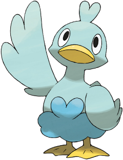
Nintendo should sell a rubber duck of this because that's all it is. There isn't a whole heck of a lot else to say about this Pokemon. Its design is very simple. In a way, that might be a bad thing. It's not a terrible design, but it is incredibly simple. I like that they stayed true to form of a duck and didn't do anything crazy with it. Look at what Game Freak did to a turtle with Torterra. However, the eyes are a problem area for me. There are some appearances it makes, such as in the sprite, where the white area of the eyes overpowers the pupils. This gives it a "deer in headlights" effect that isn't becoming for the design.
It's a fucking blue duck. What more do you want me to say?
There is only one Mighty Duck.
Introducing the latest "-lett" sensation, the best thing since Golett, Ducklett! Actually this design is a tad underwhelming, as I can't help drawing comparison to the beautiful Wingull line. While they're based on entirely different birds, similar color schemes and the same typing links them quite neatly. Let's do a quick whistlestop tour of Wingull and Ducklett. They're both birds, they both have blue coloring in places, and one is incredibly cute while the other looks brainless. I'll give you a clue: Ducklett is the latter. It seems to be an attempt at a cute pre-evolution in a line which is a giant reference to the "Ugly Duckling" story. They definitely managed to make it ugly, at least.
A very generic design. We've seen this cartoon duck design in countless other places, but only Game Freak has the ingenuity to color it blue and call it a Pokemon. There's bits at the top and coloration on the bottom to evoke a sense of...waves and water I guess? It's not offensive but totally not exciting either.
4. Virizion
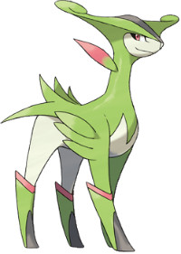
Let me preface this by saying that the "musketeer trio" is inherently dumb. That said, Virizion is pretty cool, even if it does look like Gardevoir's horse, or Shaymin Steed Forme. I like the shape of the head, and the overall sleekness (it's a word now) of the design. The hooves and the red trim are a little lazy, but whatever. It certainly won't be the ugliest of the musketeer trio because Cobalion exists and is even uglier than Raikou, which no-one thought possible. On the other hand, Virizion will never look as badass as Terrakion. You win some, you lose some.
Ever since I saw Virizion for the first time I have thought of it as the female Arceus. It has a similar body structure with a pink leaf and a pink stripe on its boots. I think all of the Musketeer trio are outstanding designs and Virizion is no exception. For me, the legendary Pokemon of this generation got back to a more organic style of design that I like to see. The third and fourth generations featured a lot of legendary Pokemon that were robotic. It's good that they are getting back to basics.
Occasionally we here at JAP are asked to analyze the design of a Pokemon which is generally indiscernible as to its origin. Thankfully, in this case, we... Well, who am I kidding? I have no idea what Virizion is. It seems to be a camp, 1970s cross between Garchomp and Mienshao, with green coloring just for fun. It's certainly the least evocative of the 'musketeer trio', though I must say I prefer it to Terriblekion.
I would just like to echo the sentiments of my colleagues before I talk about Virizion. The Musketeer trio is inherently dumb. It is. No way around it. Luckily for Virizion it's spared the embarrassment of being the dumbest of the dumb because Cobalion looks like someone forced an Otter to breed with a Smurf's Pony. On the other hand, it drew the short straw and got "the camp one" Aramis as its inspiration. I suppose that's not entirely bad, the design itself looks graceful and elegant. There's not exactly anything wrong with Virizion, I just hope it doesn't drop the soap near Terrakion, or it's gonna get ploughed regardless of its gender.
Whoo-whee, what do you call this thing? The most feminine and graceful looking of the musketeer Pokemon, Virizion's overall shape and color mesh together to form quite the pleasing aesthetic. I would rate it very highly if it weren't for the awkward as hell hairstyle, which looks like a cross between a stereotypical judge's wig and Krusty the Clown. The design for the feet is also very odd, but at least wearing four gumboots must come in handy what with the prevalence of rain in the OU metagame.
5. Leavanny
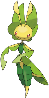
Another gentlemanly Pokemon to complement Herdier! Leavanny is pretty suave himself. While it's true that stick thin figures tend to be less cute than their rotund counterparts, I think that Leavanny manages to pull it off in a style somewhat akin to Jack Skellington. The slightly vacant expression removes any of the sinister characteristics often associated with those sneaky Bug-types. After reading Leavanny's Pokedex entries, I've grown to like it even more. A tailor Pokemon! And one that makes costumes for those cute little Sewaddles too. Great Pokemon.
What a disappointment after Sewaddle and Swadloon! Spindly things have a hard time being cute at the best of things, but the awkward carry over of a couple of the features that made its pre-evolutions cute just doesn't work here. Leavanny is like the girl in your class that hit her growth spurt before everyone else and ended up all horrible and gangly, and she fucking knows it, bumbling around with her lank arms and legs jutting out at weird angles because they can't fit under her desk. Fucking hell, Annie. Get your shit under control or just leave.
Leavanny is one of the better Bug-types that Game Freak has rolled out in the last few generations. It has the same kind of English feel as Herdier with its puffy sleeves and leaf as a headdress. My only complaint about it is its lack of facial features. I know it's a bug, but circle eyes and a big smile just isn't cutting it for me. With such a cool body, you'd think they could give it more personality than just a simple smile. That's what makes this Pokemon less appealing than something like Lucario, which has a lot of expression in its face.
You may recall, valued readers, that we talked about Scolipede in a previous issue. I said that it was my second favorite Bug-type. What is my favorite, you may ask? Well, it's no less than the excellent Leavanny! Az seems to dislike its design, but I would argue that he has simply missed the point. Leavanny represents the typical Victorian man, in elegant dress -- chivalrous and pious, among his other virtues. It is, in my eyes, one of the coolest Pokemon around, and an excellent choice by Game Freak for a design, especially creative in applying it to a Bug-type, no less!
This is a design which has grown on me. I initially didn't think much of Leavanny, but the more I look at it the cooler I think it looks. The sleek and svelte design works very well, and the colors are nicely co-ordinated, despite there being only three. The only complaint I have is that the legs should be more skinny to match the arms, but then again I guess the puffy green trousers do match the concept of a tailor / nurturing Pokemon.
| « Previous Article | Home | Next Article » |